I’ve previously blogged about the changes to the xml_deadlock_report in Extended Events to support multi-victim deadlock analysis. One of the side effects of this change was that the XML document for the deadlock report had to be modified to be able to accommodate multiple victim processes in the graph. As a result of this, the deadlock graphs that are provided by Extended Events in SQL Server 2008 cannot be saved and opened graphically inside of SQL Server Management Studio. If you attempt to open an Extended Events deadlock graph you will get an error similar to the following:
Failed to initialize deadlock control.
        There is an error in XML document (1, 2).
                <deadlock xmlns=""> was not expected
Until recently there wasn’t anything you could do about this, but today there are two options for viewing the deadlock graph in graphical format; SQL Sentry Plan Explorer Pro and SQL Server 2012 Management Studio.
Plan Explorer Pro
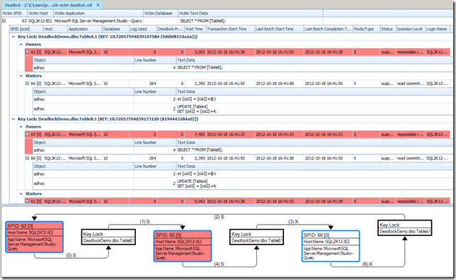
One of the new Pro features that was added in SQL Sentry Plan Explorer at the beginning of November 2012 was the ability to open deadlock graph .xdl files in Plan Explorer. The display is exactly the same display that you would get from Performance Advisor for deadlocks proactively collected during it’s monitoring, which really simplifies the analysis of the deadlock graph information. While I was beta testing the changes ahead of the public release, I mentioned that the XML from the deadlock graphs generated by Extended Events had a different output to support multi-victim deadlock analysis, and Brooke (the developer for Plan Explorer at SQL Sentry) asked for an example. A few hours later I had another beta build that handled the multi-victim deadlock graph format provided by Extended Events which is shown below.
SQL Server 2012 Management Studio
I didn’t actually realize this until I was recording the next Insider Demo Video for our SQLskills Insiders Newsletter, but SQL Server 2012 Management Studio has also been updated to handle the XML format output by Extended Events, and it also understands the multi-victim deadlock information.
However, if you compare the relative amount of information provided here, even if you use the hover tips on the individual processes, there is still a significant amount of information that is missing. For example, you don’t get the isolation levels of the processes in the graphical display at all, which can be important for troubleshooting specific types of deadlocks.
If you haven’t given SQL Sentry Plan Explorer Pro a spin, I’d really recommend it. I had the opportunity to take the next Beta release of Plan Explorer Pro for a spin last night, and there are some really awesome new features coming that will make plan analysis faster and easier than you’ve ever experienced.


One thought on “Graphically Viewing Extended Events Deadlock Graphs”
I m using SSMS 2016 & 2012 and still get the error: Failed to initialize deadlock control.